B2B
On-the-go operators
Mobile views of catalogues, tickets, and account tools for people who are not at a desk.

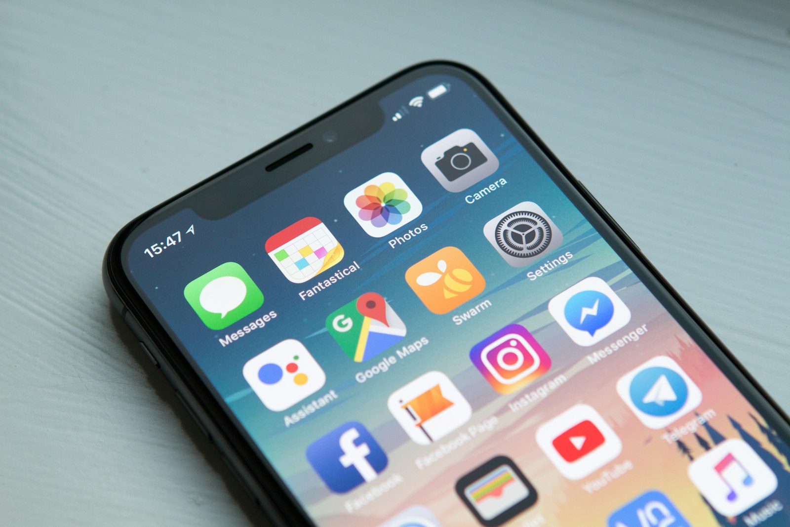
Phone-first sites for staff and customers
As smartphone use keeps changing, WebAstral Infosystems extends your communication to mobile sites. Whether you are an SME or a large account, customers stay informed about your company and use your services from a phone — without zooming, waiting, or losing your brand.
0
Projects delivered
0
Digital experts
0
Years experience











Who this is for
A mobile site has to work for a client checking a portal on the train and a shopper tapping a campaign. Neither should pinch-zoom.
B2B
Mobile views of catalogues, tickets, and account tools for people who are not at a desk.
B2C
Dedicated mobile sites and responsive pages for QR, geo, and social traffic.
Industries we ship in
Approach
With our solutions you can support marketing campaigns, micro-payments, geo-location, tracking, QR codes, and social networks.
We offer two paths: a dedicated mobile site, or a responsive design that keeps your identity while the layout adjusts to computer, tablet, and smartphone.

Scope of work
Keep your identity, improve readability, and let customers use your services from a phone — whether they are an SME visitor or a large-account client on the move.
Dedicated mobile site
A site built for phones first — campaigns, micro-payments, geo-location, QR codes, and social features that work in the hand.
Responsive design
The same website and brand, adapted to computer, tablet, and smartphone. The layout adjusts automatically so people never need to zoom.
One site, one customer experience on every device
One site, one customer experience on every device is scoped in discovery so it matches the people who will actually use it.
A layout that fits any screen resolution
A layout that fits any screen resolution is built in the delivery sprints, not left as a post-launch extra.
Single, centralized content management
Single, centralized content management is tested on the devices and browsers your customers use.
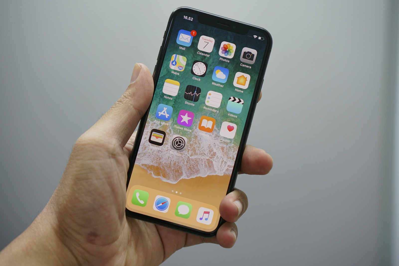
Breakpoints
Dedicated mobile site
Responsive design
Mobile websites sit alongside parallax, responsive, UX, and full web design. Explore the rest of the category when you are ready.
View all ServicesDesigned once, refined for every screen size.
01
Where the current site fails on a phone.
02
Thumb-zone nav and the pages that matter on the move.
03
Dedicated mobile or a true responsive pass.
04
Speed, tap targets, and campaign URLs.
05
Real phones, not only a resized desktop.
Stack for this service
A focused stack for this service — not a dump of every technology we have ever touched.
Proof of delivery
A mobile site has to work for a client checking a portal on the train and a shopper tapping a campaign. Neither should pinch-zoom. The portfolio has launches in Hospitality, Retail, Local services, and more.
View portfolio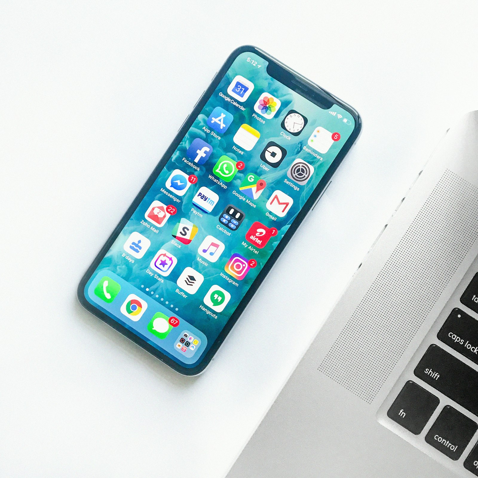
We always strive for the success of the client and their words here speak on their behalf.

“The team at webastral is an excellent talent to work with. They are experts on Prestashop. Very communicative and work to our schedule. We have been very happy to work with them on a long term basis.”
Sarah Turner
CEO
Start a conversation
Share your mobile website brief — B2B platform, consumer product, or both. You get a timeline, a stack recommendation, and a quote.
A specialist replies with next steps — not a generic brochure.
Both work. A dedicated mobile site is built only for phones. Responsive design keeps one site and one brand, then adjusts the layout to computer, tablet, and smartphone. We recommend the option that fits your campaigns, content, and budget after a short discovery.